Nuts

Client
Nuts
Category
Boutique Snack Store
Type of Work
Branding, Packaging, Motion
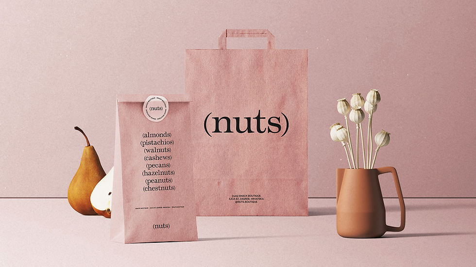
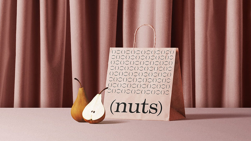
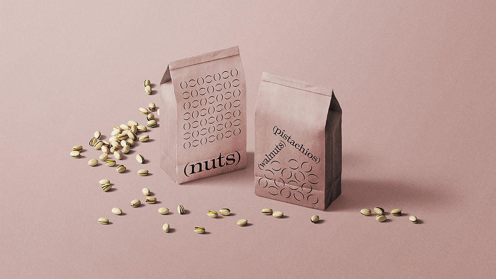
Knockingham developed the branding and packaging design for Nuts, a boutique snack store specializing in premium nuts. The visual identity was inspired by a minimalist approach to both the product and design. Drawing from the essence of the brand name, the concept centered around nutshells—an instantly recognizable element of nuts. These are represented through round brackets, forming the foundation of the design system.
Using only typography and color, the result is a solution that is both strikingly distinctive and highly practical. This adaptable system enables seamless expansion of the product range without requiring additional illustrations or photography.


The color palette is inspired by products like pistachio and turmeric cashew. Motion design mimics realistic physics to give the stylized brackets a tangible connection to the nutshells.


The Temeraire typeface gives the brand an organic and elegant character with its expansive contrast and humanist details. The secondary typeface Matter is used for better legibility in smaller point sizes and creates a pleasant contrast to the primary font.


